How to Create a Donation Page for Fundraising & Giving Days


Categories
Publish Date
Share


Ready to Build a High-Converting Donation Page?
Schedule a free consultation to understand how Fifty & Fifty can help you craft seamless, donor-focused pages that maximize giving.
Picture this: you’re at a fundraising gala surrounded by potential donors, the energy is positive, you know your mission is compelling, and you make the perfect pitch in front of an engaging group. A donor nods enthusiastically, pulls out their wallet—and then, just as they’re about to tap their credit card, you hit them with:
- A clipboard with ten pages of forms.
- Your card reader that freezes mid-transaction.
- A final request for them to go home, fire up their desktop computer, and fill out an even longer online form.
Sounds ridiculous, right? But this is exactly what’s happening on thousands of nonprofit donation pages every single day. The modern donor isn’t walking into a gala, ready to pay. They’re landing on your website. If that experience isn’t seamless, intuitive, and compelling, they’re gone, possibly forever.
So, to be blunt: your donation page is either your biggest asset or your biggest liability. Ask yourself: is your donation page actually working or is it quietly turning away people who were ready to give?
This guide will help you create a donation page that removes friction, builds trust, and gets more people clicking that final “Donate” button.
We’ll cover:
- The mistakes most nonprofits make on their donation pages (and how to fix it).
- Real-world examples of high-performing donation pages.
- Giving Day-specific strategies to maximize year-end fundraising success.
Why a Great Donation Page Matters
- Your Donation Page Has One Job But Most Fail to Do It Well -
A donation page should do one thing exceptionally well: turn a potential donor into an actual donor quickly and seamlessly. But here’s the reality: some donation pages don’t just fail, they actively discourage giving.
With the right design, storytelling, and user experience optimizations, you can dramatically increase donations. So, let’s break it down: why are so many donation pages failing? And what can you do to make sure yours doesn’t?

Mistake #1: Your Page Doesn’t Establish Trust
Donors don’t just give—they invest in your mission. And like any investor, they need to trust that their money is being used wisely.
According to a recent study from 2024, 73.4% people value whether the charity’s appeals are truthful, accurate, and not misleading. Yet, many nonprofits fail to include even basic trust signals on their donation pages.
How to Fix It:
- Independent financial transparency: clearly state how donations are spent and link to impact reports or third-party evaluations.
- Security and privacy assurance: clearly display data protection policies and how donor information is secured.
- Authenticity in storytelling: avoid overly polished or sales-driven language. Instead, provide real, factual, and heartfelt appeals supported by impact numbers.
Mistake #2: Your Page Overcomplicates the Giving Process
— The fastest way to lose a donor? Make giving feel like work —
Think about your own experiences with online shopping. When you have to create an account (with more information than you’re comfortable with) and navigate confusing checkout screens, did you complete the purchase? Probably not.
The same logic applies to donation pages. A donor lands on your page, motivated and ready to give. But instead of a smooth process, they’re met with:
- A long, cluttered form asking for unnecessary details like their mailing address or how they heard about the organization.
- A confusing layout with too many buttons, sidebars, and competing CTAs.
- Multiple redirects before they can even enter their credit card information.
At that very moment, their enthusiasm fades. Every additional second spent navigating a frustrating process increases the likelihood they’ll abandon their donation altogether.
How to Fix It: Create a Frictionless Giving Experience
A donation form should ask for only what is absolutely necessary:
- Name
- Email address
- Payment details
That’s it! You don’t need their phone number, address, or an explanation of how they found you, especially for one-time gifts. If you must collect additional details, save them for after they click “donate”, a thank-you email, or follow-up campaign.
Mistake #3: There’s No Emotional Hook
Donors don’t give to organizations—they give to people, causes, and movements they emotionally connect with. People donate when both their emotions and logic align: compelling stories inspire them, and clear impact reinforces their decision. Yet, too many donation pages are transactional instead of emotional. These say:
“Donate now to support our programs.”
Instead of:
"$50 today will provide school supplies for a child in need.”
How to Fix It:
- Use storytelling: introduce a real beneficiary with a name, photo, and personal story.
- Make it visual: pages with compelling images or videos convert better.
- Create urgency: “Everyday counts—give now to help a family in need today.”
The Psychology of a High-Converting Donation Page
A well-optimized donation page taps into psychological principles to encourage giving:
- Simplicity Bias: people avoid complicated processes, keep it simple.
- Social Proof: testimonials and donor activity increase credibility.
- Urgency: limited-time campaigns (e.g., Giving Tuesday) boost donations.
- Emotional Appeal: storytelling connects donors emotionally to your cause.
Action Step: Review your current donation page and identify friction points that might discourage donors.
Key Takeaways: What You Should Do Right Now
Trust is currency: If your donation page doesn’t establish credibility immediately, donors will leave. Add security badges, testimonials, and third-party endorsements.
Simplicity wins: Every extra step you ask a donor to take reduces the likelihood they’ll complete the process. Streamline your design and form fields.
Emotion drives donation: Facts don’t inspire giving—stories do. Use real beneficiaries, compelling images, and impact-driven messaging.
A/B test from A-to-Z: Even small changes—like button color, image placement, or fewer form fields—can increase conversions by double digits.
Create a High-Converting Donation Page
Define Your Fundraising Goal
Your donation goal should be clear and transparent. When donors know exactly where their money is going, they feel more inclined to give. When you set up a donation page, it should:
- Show tangible impact: instead of saying, “We need to raise $10,000,” say, “$50 provides food for a family for a month.”
- Break down donation tiers: give donors a sense of what their contribution accomplishes.
- Use progress bars: real-time tracking of donations builds momentum.
Craft a Compelling Story
Facts inform, but stories inspire. Your donation page should tell a powerful story that evokes emotion and urgency.
Elements of a Compelling Fundraising Story:
- Introduce a real person/beneficiary affected by the cause
- Describe the problem in a relatable way
- Show how donations directly create change
- Use impactful images and videos
Action Step: add a real-life impact story to your donation page to increase emotional engagement.
Optimize Your Donation Form
A well-structured donation form makes it easy for supporters to give. Ensure your donation page is direct, leading people to a form above the fold with little distractions
Key Features of a High-Converting Donation Form:
- Keep it short: keep forms short and sweet. Every field you add has an exponential effect on the conversion rate of the form. Get what you need and ask for more information later.
- Use multi-step forms: ask for the donation amount first, then request additional details later.
- Enable recurring donations: highlight the option for monthly giving.
- Offer multiple payment options: credit cards, PayPal, Apple, Google Pay, even crypto.
- Include a matching gift option: programs like Double the Donation increase contributions.
Action Step: Remove fields that slow down donations. Fewer barriers mean a smoother path to giving.
Bonus Tip: Connect your form to a true CRM, where you can analyze and automate communications with your donors.
Step 4: Add Visuals & Trust Signals
Visuals increase donor confidence and make your page more compelling. When you create a fundraising page, it should:
✔ Use high-quality images of the people your nonprofit serves.
✔ Show donation impact in action (before-and-after photos work great).

✔ Include security badges (e.g., SSL certificate, nonprofit verification).
✔ Add donor testimonials to build credibility.
Action Step: test adding an image or testimonial near your donation form to boost conversions.
Step 5: Test & Promote Your Donation Page
Once your page is live, ongoing testing and promotion will help maximize donations.
A/B testing is a user experience research strategy that involves showing two variations of a web page to different sets of website visitors. It aims to determine which design better drives conversions or, in this case, donations.
A/B Testing Ideas:
- Banner Image: Your banner image is a key visual element on your donation form. Experiment with different options to identify which visuals resonate most with visitors and encourage more contributions.
- Headline Text: The headline is one of the most memorable aspects of your page and a key indicator of its purpose. Test different phrasing to see what captures users' attention and motivates them to donate.
- Color Scheme: Leverage your organization's brand colors to experiment with button and header variations. Use your website’s existing design as a reference, then refine your choices to create the most effective donation page.
- Suggested Giving Amounts: Donors often rely on preset giving amounts when deciding how much to contribute. Test increasing or decreasing these suggested amounts to see how they influence average donation sizes.

Promotion Strategies:
✔ Social Media Campaigns: Leverage platforms like Facebook, Instagram, and LinkedIn to reach a broader audience. Use engaging visuals, compelling stories, and donor testimonials to inspire contributions. Consider running paid ads or utilizing platform-specific fundraising tools (e.g., Facebook Fundraisers). Learn how to implement social media for nonprofits with our ultimate guide.
✔ Email Marketing: Send personalized email appeals to past and potential donors, highlighting the impact of their contributions. Segment your audience to tailor messages based on their donation history and engagement level. Include urgent calls to action, donation match opportunities, and success stories to boost conversions. Read our guide in how to implement email marketing for nonprofits.
✔ Google Ads for Nonprofits: Take advantage of Google Grants to run search ads that drive traffic to your donation page. Optimize ad copy with high-intent keywords like “donate to [cause]” or “support [organization name]” to attract potential donors who are already searching for ways to give.
✔ Influencer & Community Partnerships: Collaborate with influencers, brand ambassadors, and community leaders who align with your mission. Their endorsements can boost credibility and expand your reach to new potential donors. Read our guide about influencer marketing for nonprofits.
✔ Peer-to-Peer Fundraising: Encourage existing donors and supporters to create their own fundraising pages and share them with their networks. This grassroots approach helps amplify your campaign through personal connections.
✔ Retargeting & Follow-Ups: Implement retargeting ads or follow-up emails to reach visitors who engaged with your donation page but didn’t complete a gift. A gentle reminder can significantly improve conversion rates. For more insights about tracking and KPIs, check our nonprofits analytics guide.
“The best donation pages remove friction and create momentum. They combine emotionally resonant storytelling with a seamless user experience backed by smart strategy, strong brand clarity, and thoughtful design. When every element is aligned with your donor’s intent, giving becomes the easiest decision they’ll make all day.” — [Javan Van Gronigen, Founder/ Creative Director, Fifty & Fifty.]
Optimize Your Donation Pages for Giving Days
Giving Days such as Giving Tuesday are high-impact fundraising events that create a sense of urgency and drive significant donation spikes. Whether you're a small nonprofit looking for cost-effective tactics or a large organization leveraging data-driven strategies, optimizing your donation page can make all the difference.
Best Practices for Giving Days
✔ Use Clear, Action-Driven CTAs: Make it easy for donors to take immediate action with compelling CTAs like “Donate Now to Double Your Impact” or “Give Before Midnight to Help Us Reach Our Goal!”. Larger organizations can segment their CTAs for different donor tiers, while smaller nonprofits should focus on a single, high-impact message.
✔ Leverage Countdown Timers for Urgency: A real-time countdown clock builds anticipation and encourages last-minute giving. Smaller nonprofits can use free tools like TickCounter, while larger organizations can integrate timers into their email campaigns using HubSpot, Mailchimp, or Salesforce.
✔ Highlight a Matching Gift Program: If a corporate or major donor is offering a matching gift, prominently display it with messaging like "Your Donation Will Be DOUBLED Until Midnight!". Smaller nonprofits can seek match challenges from board members or major supporters, while larger organizations can activate corporate partnerships for large-scale impact.
✔ Make Social Sharing Effortless: Giving Days thrive on community participation. Embed “Post This”, “Share on Facebook”, and “Spread the Word” buttons to allow donors to amplify their impact. Small nonprofits should focus on grassroots peer-to-peer sharing, while larger organizations can invest in paid social media campaigns and influencer partnerships.
✔ Show Real-Time Fundraising Progress: Live fundraising thermometers or donor recognition tickers build excitement and encourage others to join in. Smaller organizations can use simple website plugins, while larger nonprofits may benefit from more advanced leaderboards and real-time donor-tracking tools.

Giving Day Strategy Comparison for Small vs. Large Nonprofits
Bonus: Download our Giving Day Calendar to stay ahead of key fundraising dates!
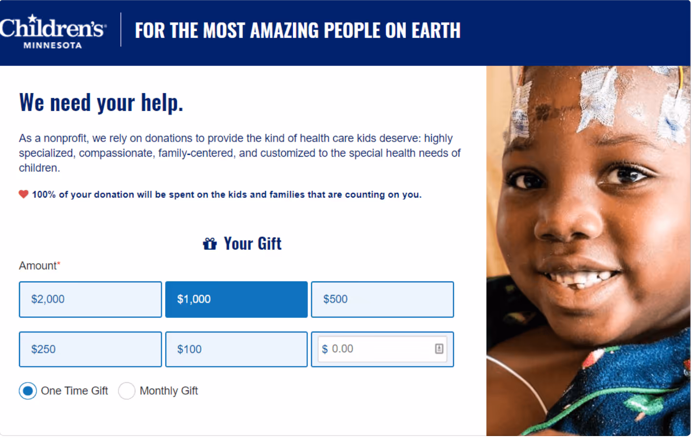
Proven Donation Page Designs That Inspire Giving
Here are three nonprofit donation pages that excel in design and conversion:
1. Curebound
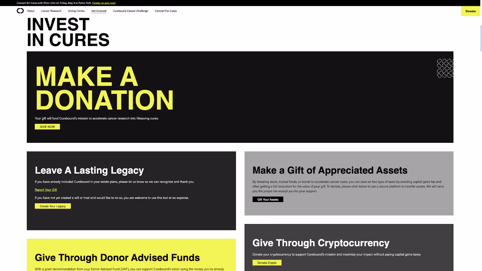
Curebound is a San Diego-based 501c3 philanthropic organization that raises and invests strategic funding for cancer research aimed at finding a cure in our lifetime. They needed strategic and creative communication to carry out their current goals, and adapt to the evolving vision throughout the year.
With the help of Fifty & Fifty, the organization developed email and social assets, a paid media push, and a customized landing page experience based on the collaboratively developed creative concept.
Why it Works:
✔ Emotional Storytelling: The page effectively connects donors to the cause through compelling visuals and heartfelt narratives. The use of real patient stories and impactful messaging fosters an emotional connection.
✔ Clear and Bold CTAs: The donation call-to-action is prominently placed, with action-driven language like “Give Now to Fund Life-Saving Cancer Research”, reducing friction in the giving process.
✔ Seamless User Experience: With a clean, mobile-friendly layout, Curebound ensures that donors can easily contribute from any device, increasing conversions.
✔ Trust Signals & Transparency: Featuring funding impact details and partnerships helps establish credibility, reassuring donors that their contributions are making a real difference.
2. Charity: Water
Charity Water is a beautiful giving page that blends multiple ways to give with stories of hope and impact. The visuals and direct appeals make it an easy way to get hooked and find the donation method that fits you best.
Why it Works:
✔ Distraction-Free Layout: The clean, minimalist design keeps the focus on the mission, removing any unnecessary elements that might cause friction.
✔ One-Step, Seamless Donation Process: A simple, single-page checkout reduces donor hesitation and streamlines the giving experience.
✔ Strong Visuals & Impact Metrics: Charity: Water uses high-quality images and statistics to show donors the direct impact of their contributions.
✔ Recurring Giving Option: A well-placed monthly donation toggle encourages sustained support, helping to maximize long-term contributions.
3. 1517 Fund

1517 built a clean, simple multi-step form that provides multiple ways to pay and no confusion around what to do. Keeping the giving simple maximizes conversion, with multi-step forms making the process of giving digestible and linear.
Why it Works:
✔ Minimalist Design, Maximum Impact: 1517’s donation page is simple, distraction-free, and focused on action, helping donors complete their gifts quickly.
✔ Compelling Mission Statement: The page opens with a clear, concise mission, immediately communicating why donations matter.
✔ Recurring Giving Option: 1517 encourages donors to make their gift monthly, helping build a sustainable funding stream.
✔ Community-Centric Approach: By emphasizing peer-driven support, the page makes donors feel like they are part of a larger movement.
4. Tumo Campaign
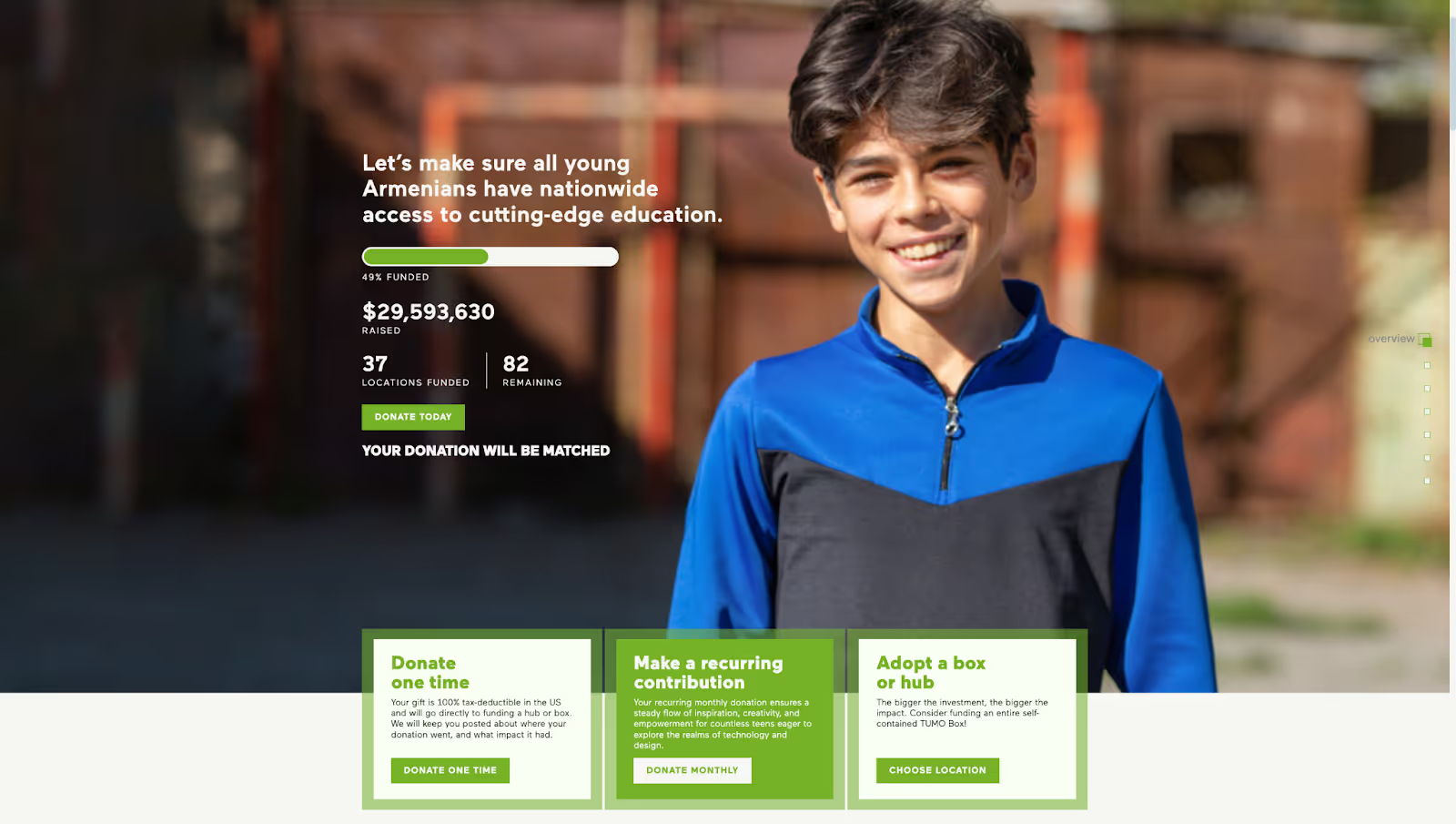
Tumo campaign is a great example of both a campaign and multiple donation page designs built for each target audience. Each page speaks to the motivations of the donor and gives tangible benefits and results from the donation being made.
Why it Works:
✔ Dynamic, Engaging Visuals: TUMO’s donation page uses bold graphics and interactive elements to keep visitors engaged.
✔ Data-Backed Impact Statements: The page showcases real-world results with numbers that highlight the program’s success.
✔ Localized Giving Options: TUMO allows donors to choose specific regions or programs to support, making their gifts feel more personalized and meaningful.
✔ Social Proof & Urgency: The page leverages testimonials and urgency-driven messaging to encourage immediate action.
Looking for inspiration? Check our nonprofit website examples that drives conversion to inspire your brand.
Final Takeaways: Creating Donation Pages That Convert
A high-converting donation page goes much beyond its aesthetic value—it creates an intuitive, emotional, and trust-driven experience that motivates donors to act. Whether you're a small nonprofit relying on grassroots support or a large organization leveraging data-driven strategies, the key to success lies in creating a seamless, emotionally compelling, and action-driven giving experience.
Key Takeaways:
- Simplify your donation form for ease of giving.
- Tell a compelling story that evokes emotion.
- Use visuals & testimonials to build trust.
- Test & iterate to improve performance over time.
- Leverage Giving Days to create urgency.
Want a Donation Page That Actually Converts?
Book a free strategy call with Fifty & Fifty to learn how we design donor-first pages that build trust, reduce friction, and boost online giving. Let's talk!
Have a project or idea?
We believe in the hard work people are doing to address the world's most pressing problems. Every day, our agency fights to turn visions of social change into concrete realities.

Proven Strategies to Secure Unrestricted Operating Support for Nonprofit Growth
.avif)
4 Strategies for Communicating with Your Corporate Sponsors

Unleashing Maximum Impact: Why Foundations Choose a Spend-Down Model
How to Create a Donation Page for Fundraising & Giving Days