Drawing Global Attention to Syria with Live Images
International Committee of the Red Cross
The International Committee of the Red Cross (ICRC) is a humanitarian organization that protects and assists victims of armed conflict and violence around the world. Operating in some of the most challenging environments, ICRC provides medical care, reunites families, delivers essential supplies, and works to ensure that international humanitarian law is respected. Their presence in conflict zones like Syria and Lebanon is critical to supporting communities caught in the crossfire.
The Problem
The International Committee of the Red Cross needed to draw public attention and media coverage to the humanitarian crisis in Syria. But getting people to care about a far-away conflict is difficult.
How do you capture the reality of a war-torn place without losing the details that make it real? How do you make people thousands of miles away feel the weight of what's happening on Syria Street—where neighbors are pitted against one another and daily life is defined by chaos?
They needed a way to tell the story that wouldn't be ignored or scrolled past.
Our Solution
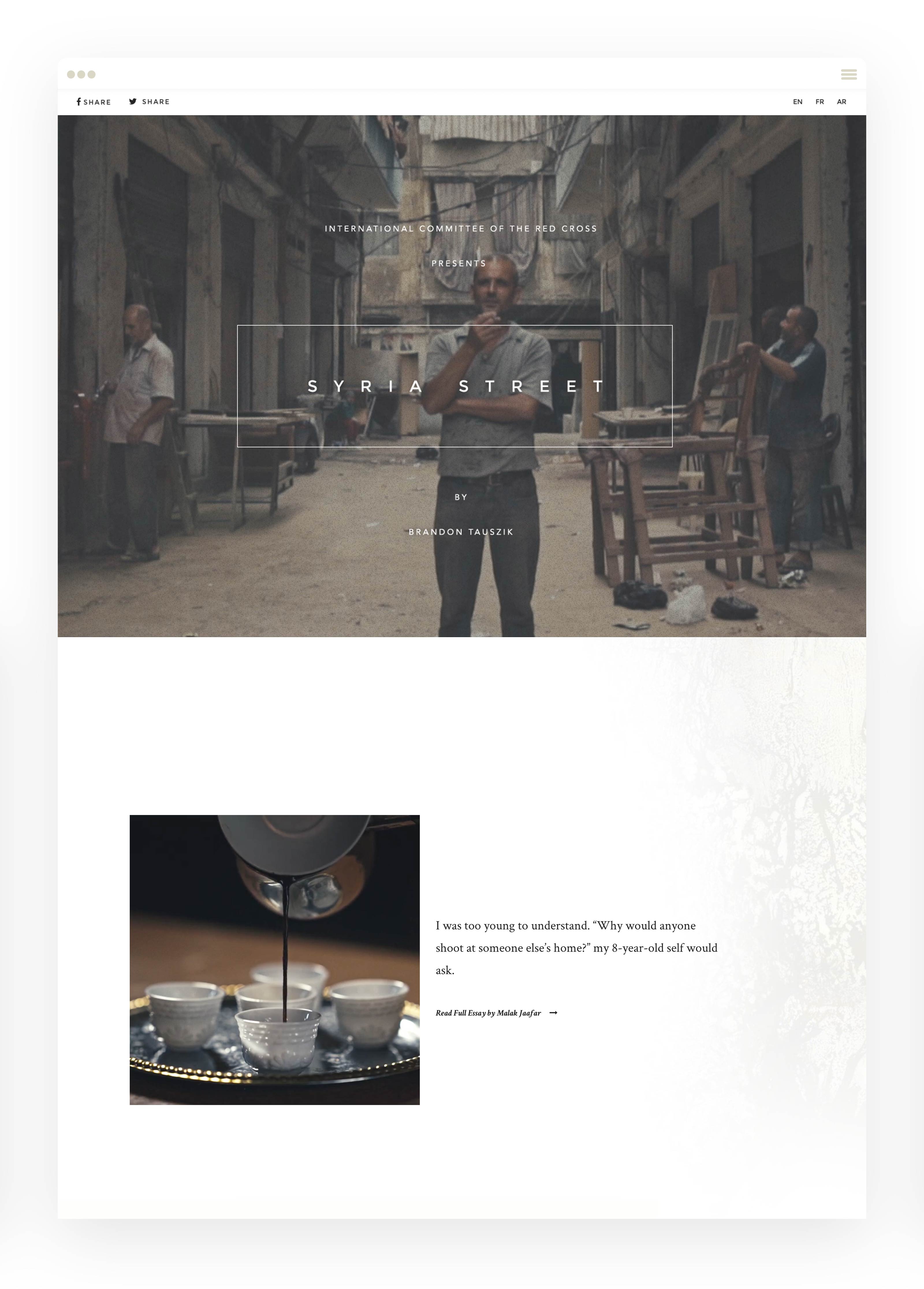
We created Syria Street: an immersive, interactive landing page that brought the crisis to life through animated photography and powerful storytelling.
Working with photographer Brandon Tauszik, we showcased the work ICRC was doing in Lebanon and told the stories of people living through the chaos of civil war. The page featured high-quality animated imagery that captured movement and emotion, giving users a window into a world most would never see.
Our designers used textural maps, subtle colors, and clean lines to distinguish separate sides of the conflict. Intentional spacing between sections gave each story room to breathe, allowing content to sink in one at a time without overwhelming the user.
We also tackled a technical challenge: the high-quality animated GIFs were massive files that played inconsistently across devices. We used high-res, compressed video on repeat for desktop and progressively loaded GIFs as users scrolled on mobile—delivering both performance and artistic quality.

Let us tell your nonprofit's story
We believe in the hard work people are doing to address the world's most pressing problems. Every day, our agency fights to turn visions of social change into concrete realities.

Case Studies
Nuru International
Rebranding a Locally-Led Movement Breaking the Traditional Aid Model

UNEP - World Environment Day
An integrated HubSpot-powered digital ecosystem and campaign microsite driving over 5M global impressions, and over 3,000 events in 155 countries.

Volunteer Match
A digital media campaign execution that generated 278K impressions and 870 monthly leads, surpassing performance goals by up to 8x

San Diego Foundation
A full brand and website redesign, building a scalable digital platform that improved conversions by 41%

San Diego Foundation Youth Report

National University
A digital strategy and website experience that increased program visibility by 56%.
