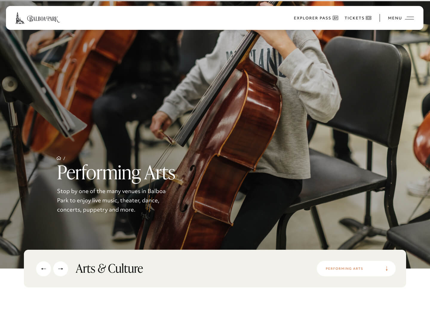
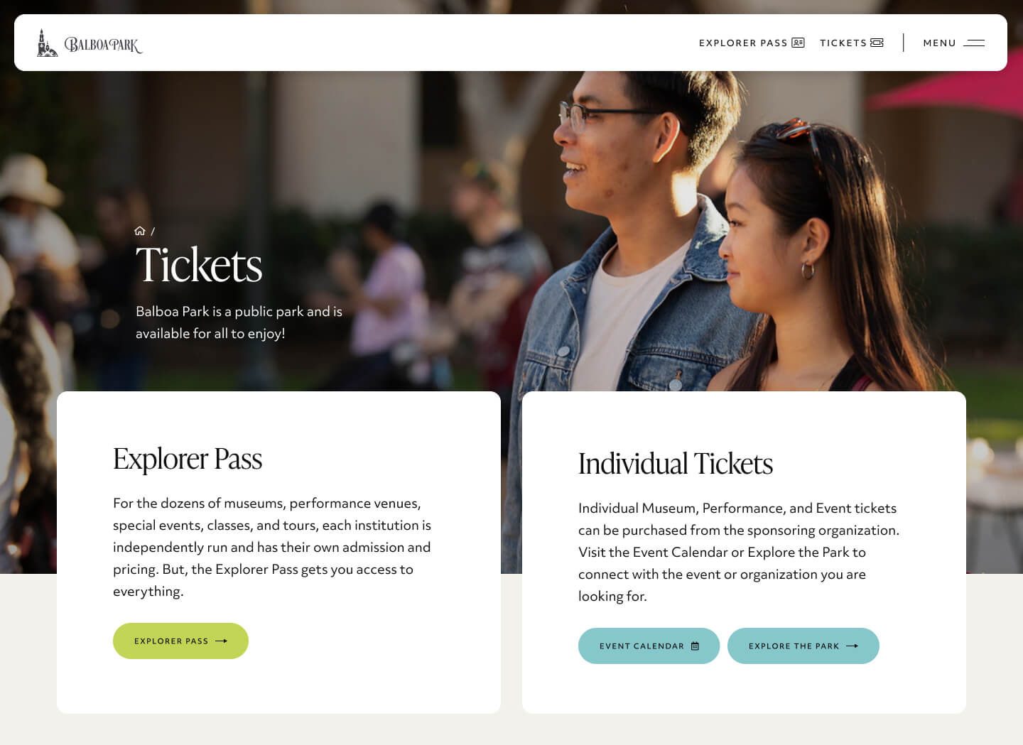
Redesigning the Digital Gateway to San Diego's 1,200-Acre Cultural Hub
Balboa Park
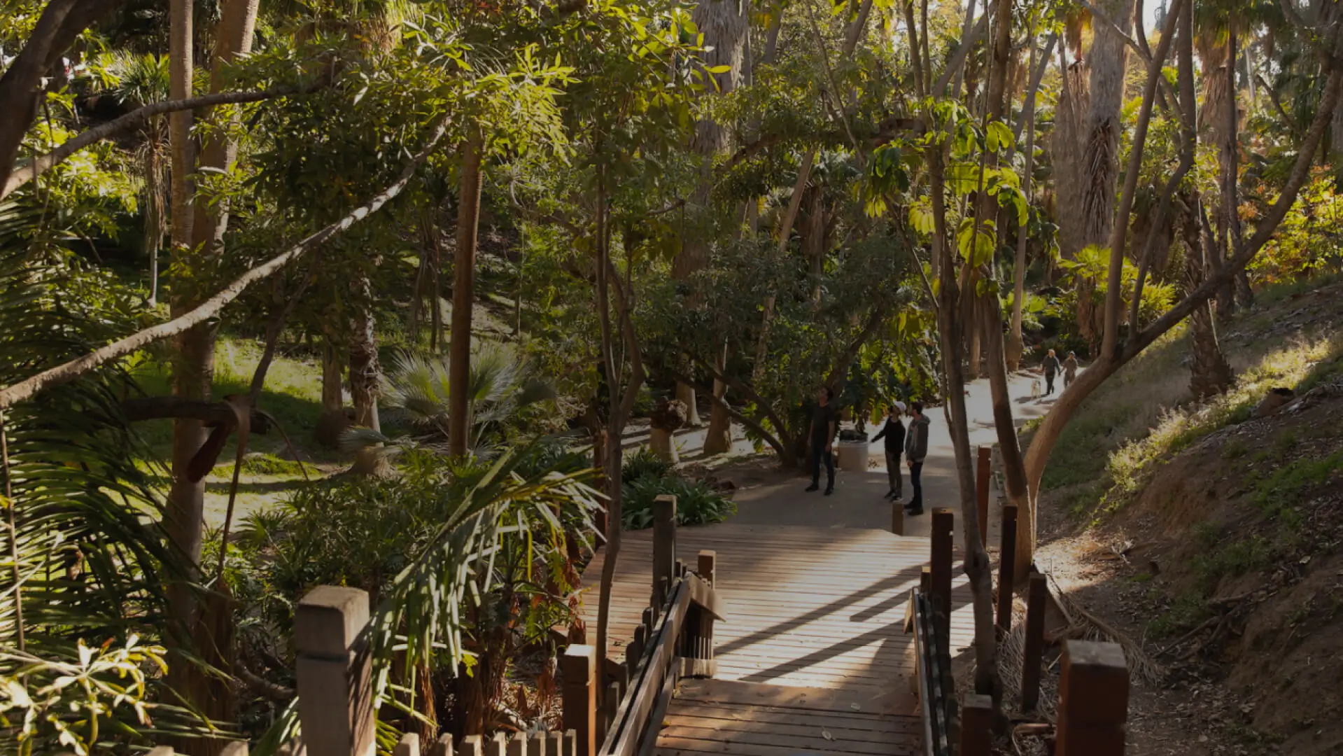
Balboa Park is one of San Diego's most iconic destinations: a 1,200-acre cultural park home to world-class museums, gardens, theaters, and attractions. It's a living landmark that draws millions of visitors each year, serving as both a tourist destination and a beloved backyard for locals. The park is managed through a collaborative effort between multiple organizations working together to preserve and promote this historic space.
The Problem
Balboa Park had a website problem. The site was overloaded with external content, third-party tools, and clunky plugins that made it nearly impossible to navigate. Visitors trying to explore the park or find basic information (hours, events, attractions) were met with confusion and frustration.
For one of the region's biggest tourist attractions, the digital experience was failing. The site wasn't inspiring people to visit. It was making them work too hard to plan a trip.
They needed a website that felt as welcoming and intuitive as the park itself.
Our Solution
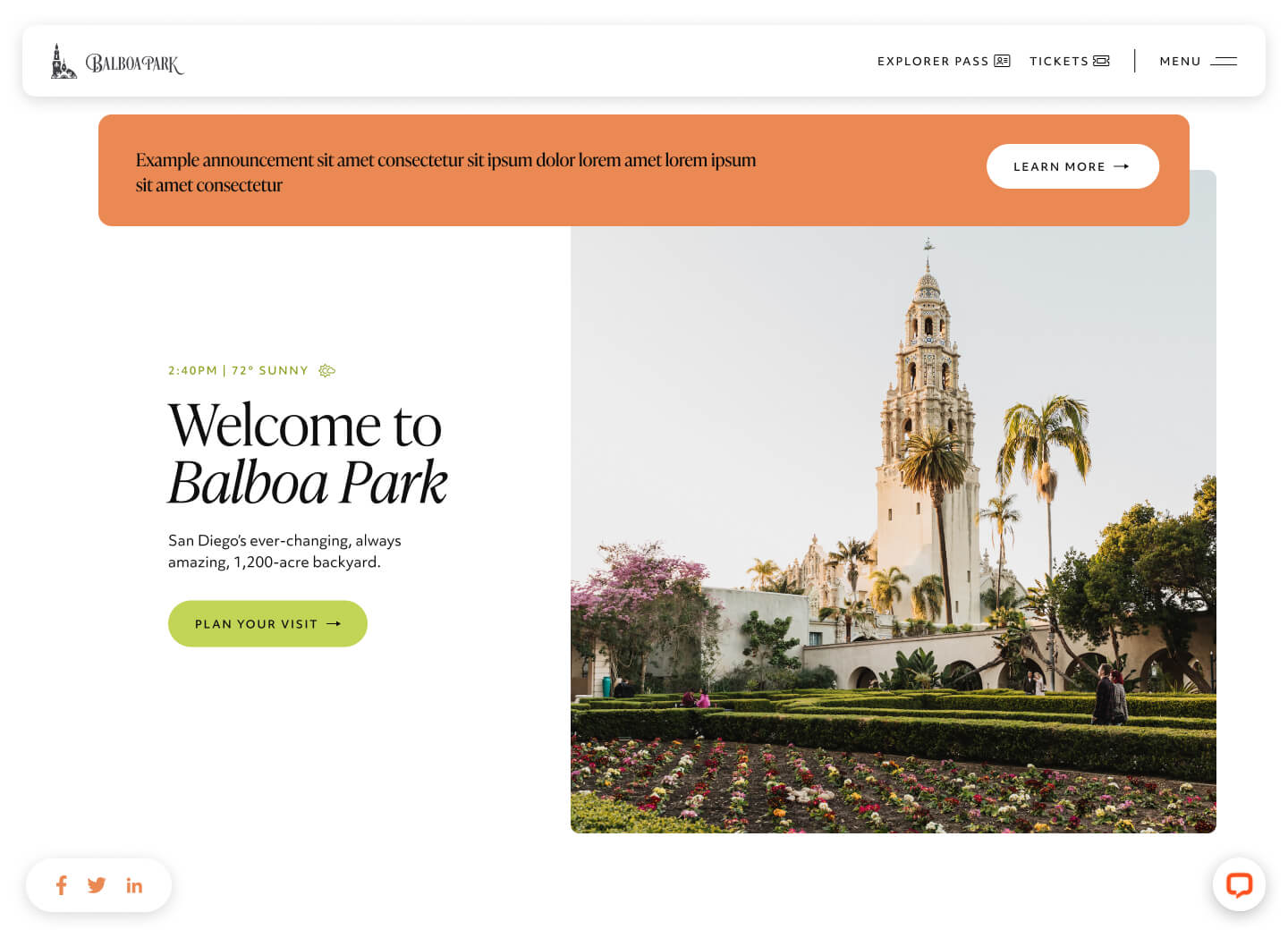
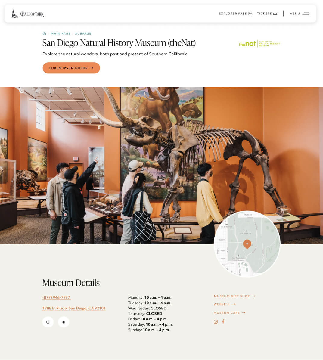
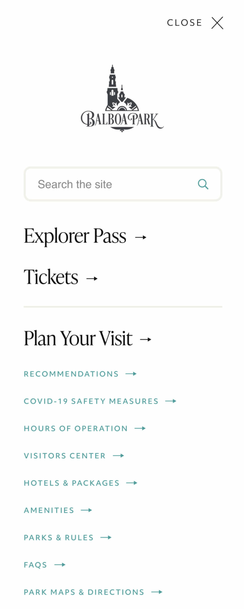
We started by digging into the existing site—thousands of pages, locations, and attractions—and reorganized everything into a structure that actually made sense.
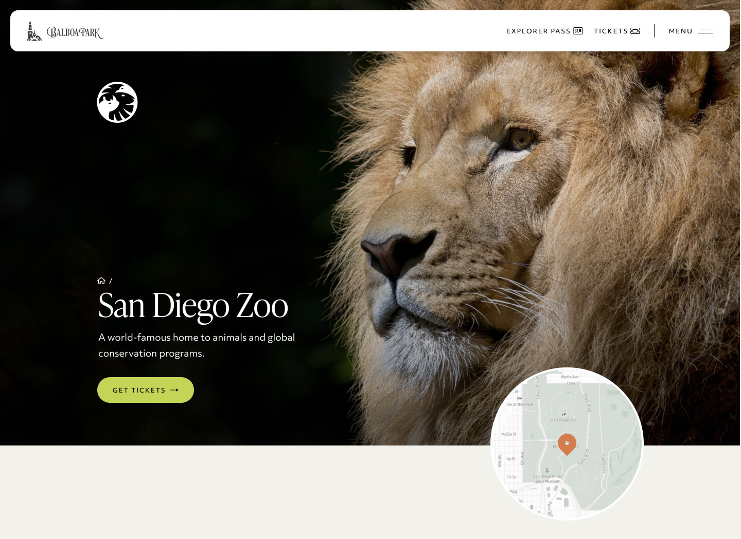
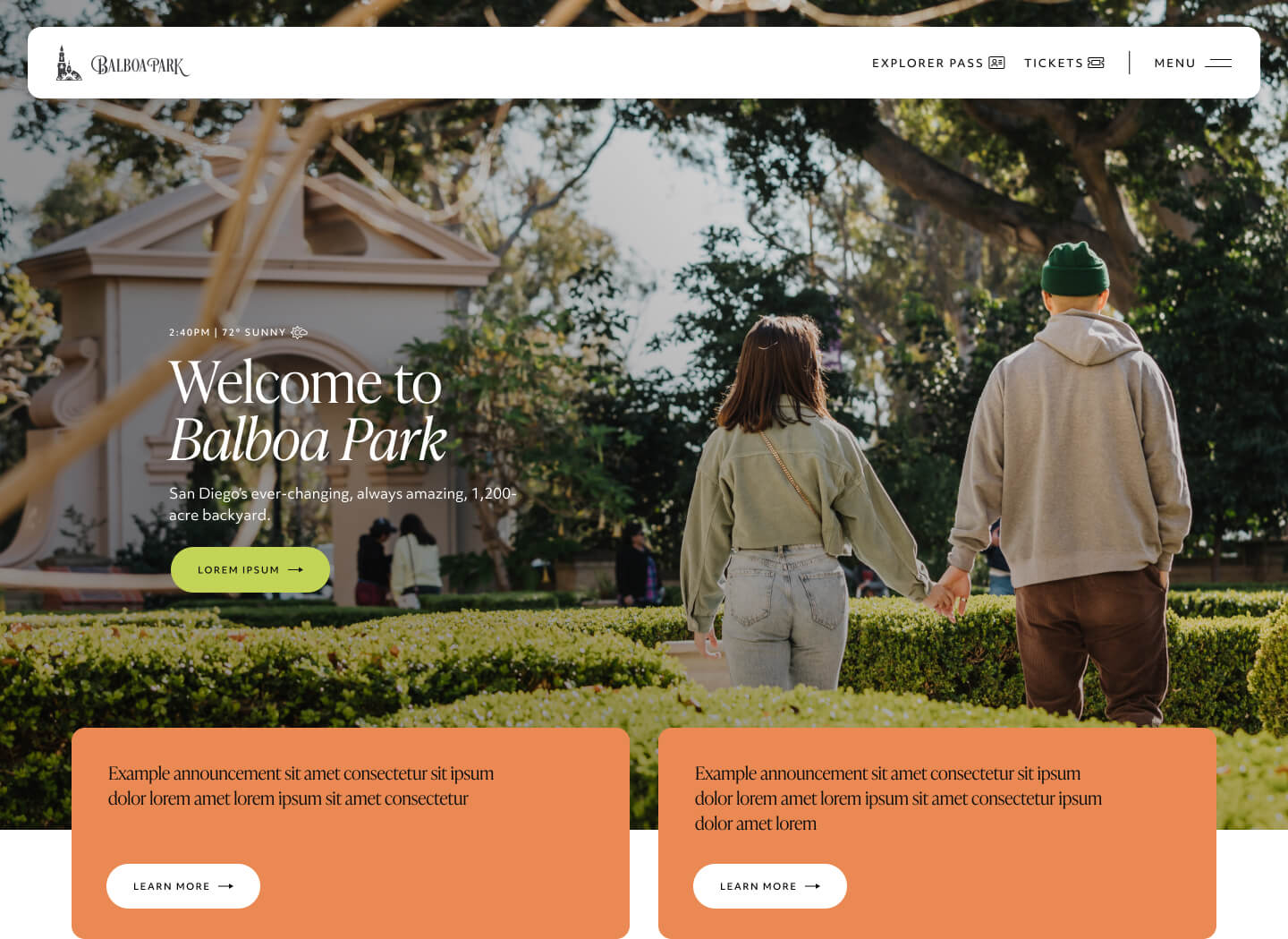
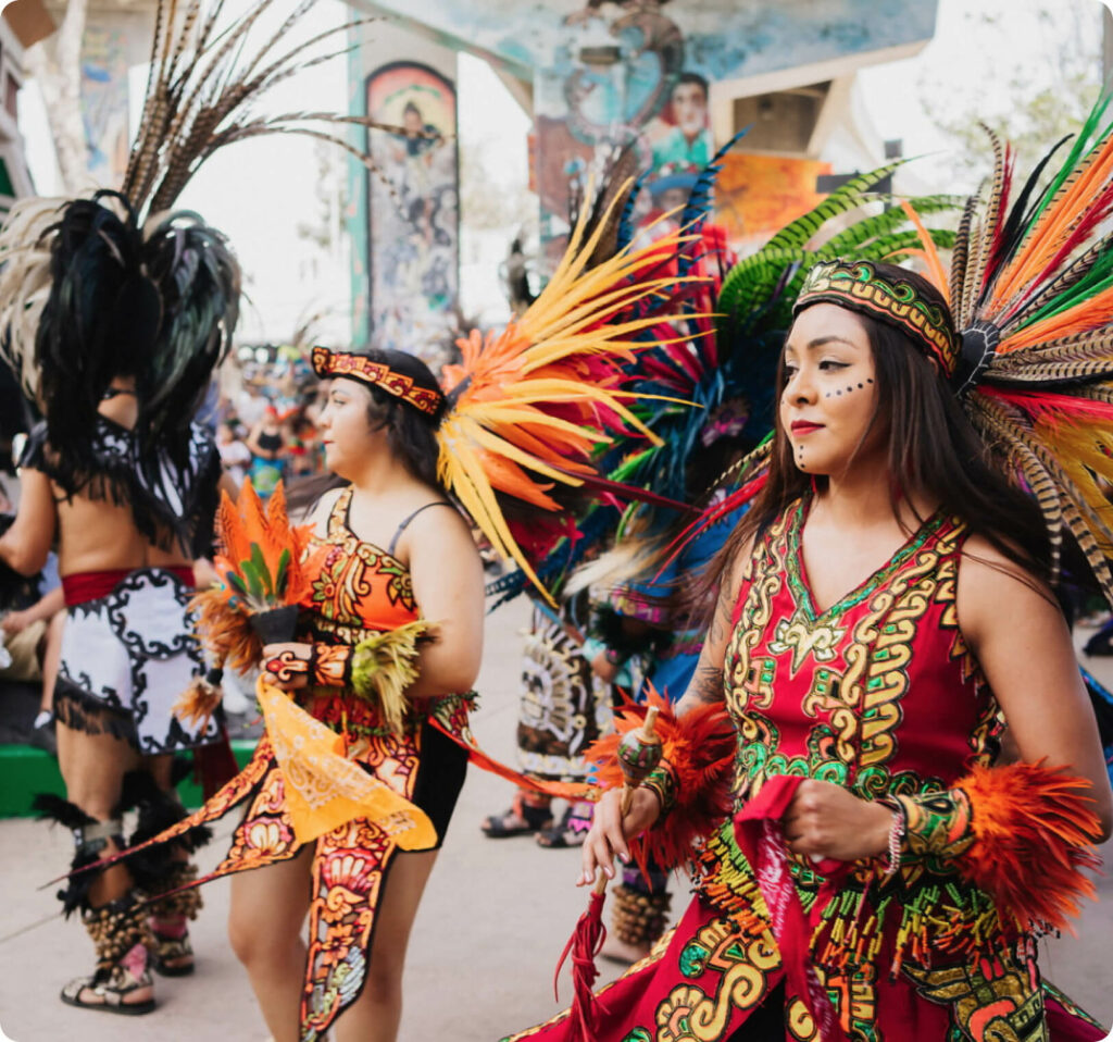
We ran user testing to ensure the new navigation and calendar solution helped people find what they were looking for without hunting. We designed a look and feel that captured the authenticity of the park, its visitors, and the San Diego region.
The goal was simple: give users a true sense of what visiting Balboa Park would be like while making it easy to actually plan their trip. No frustration. No confusion. Just a clear path from browsing to booking.





Let us tell your nonprofit's story
We believe in the hard work people are doing to address the world's most pressing problems. Every day, our agency fights to turn visions of social change into concrete realities.

Case Studies
San Diego Foundation Youth Report
San Diego Foundation
Redefining a Foundation's Digital Identity to Match a Bold New Vision

Real Organic

The Game Changers
Growing a movement behind one of Netflix's biggest documentaries

National University
Building Brand Awareness and Driving Conversions for a Learning Platform

