Nonprofit Website Redesign Guide: Avg. Costs, Best Practices & Examples


Categories
Publish Date
Share


Redesign for Impact
We build nonprofit websites that increase trust, reach, and donations. Get your free redesign consultation today.
Your nonprofit’s website shouldn’t just sit there—it should work for you. It’s your most powerful tool for telling your story, building trust, and turning visitors into donors. But if your site feels outdated, doesn’t reflect your mission, or fails to inspire action, you’re not alone. Many nonprofit leaders face the same challenge: a website that costs time and money but delivers little return.
We get it—redesigning your nonprofit website can feel overwhelming, especially when time and budgets are tight. But the truth is, a smart redesign can transform how people see and support your mission. In this guide, we’ll walk you through what a high-impact nonprofit website should include, how much it really costs, and how to get it right without stretching your resources.
Redesign for Impact
We build nonprofit websites that increase trust, reach, and donations. Get your free redesign consultation today.
LET’S TALK
Why Redesign Your Nonprofit Website?
A nonprofit website redesign is much more than just a fresh coat of paint. It’s an opportunity to align your online presence with your mission, remove friction from the donor journey, and adopt modern web practices that drive real results. Here’s why a redesign may be the best investment your nonprofit makes this year.

1. Improved Donor Engagement & Trust
Would you donate to an organization whose website looks like it hasn’t been updated since 2010? Probably not—and your potential donors feel the same way.
- Outdated Design = Lost Donations: According to Zippia, 75% of a company’s credibility is based on website design. This means that if your website looks outdated, slow, or difficult to navigate, visitors may question your legitimacy before they even read about your mission. A modern, visually compelling design not only reassures visitors that your organization is active and trustworthy but also makes them more likely to take action—whether that’s donating, signing up for a newsletter, or volunteering.
- Security Matters More Than Ever: Beyond aesthetics, security plays a crucial role in trust. If your website lacks HTTPS encryption, has outdated software, or experiences frequent downtime, it can send red flags to potential donors. An insecure website can also be blacklisted by search engines, making it harder for people to find you online. A redesign ensures your site is secure, up-to-date, and fully compliant with modern security standards.
2. Increase Donations & Conversions
Your website should function as a 24/7 fundraising tool—not as a digital brochure. If visitors struggle to find your donation page, understand your impact, or trust your payment processing system, you’re leaving money on the table.
- Optimized Donation Flows Drive More Giving: A well-structured, distraction-free donation page can significantly impact conversion rates. For example, nonprofits that streamline their donation process (reducing the number of steps and offering digital wallets like Apple Pay or Google Pay) see higher completion rates.
The Barstool Fund, launched by Barstool Sports during the COVID-19 pandemic, aimed to provide financial relief to small businesses struggling to survive. While the campaign had widespread media attention, they needed an efficient and seamless online donation process to maximize contributions.
In partnership with Donately, the organization created a donation platform optimized for user experience and conversion. They implemented:
- A simple, intuitive donation form that reduced friction for donors and increase trustworthiness.
- Recurring giving options to encourage sustained contributions.
- Mobile-friendly design to ensure easy donations across all devices.
- Seamless payment integrations with Apple Pay and Google Pay.
As a result, the Barstool Fund successfully raised over $41 million, helping 443 small businesses survive the pandemic. The streamlined donation process played a key role in converting site visitors into donors, ensuring a frictionless giving experience.
Pro Tip: Use suggested donation amounts to encourage larger gifts. A field experiment titled “Round Giving: A Field Experiment on Suggested Charitable Donation Amounts” found that adjusting suggested amounts can significantly impact both the likelihood and size of donations. In the experiment, changing a suggested amount from $100 to $95 reduced the number of gifts greater than or equal to $90 by more than 30%.
3. Improve Accessibility & Inclusivity
Nonprofits serve diverse communities, and your website should reflect that by being accessible to everyone—including people with disabilities.
- What is Web Accessibility?: Web accessibility ensures that people with disabilities can navigate and engage with your website. The World Health Organization estimates that 1.3 billion people, or 16% of the world population, experience significant disability. According to the CDC, 28% of adults, or roughly one in four, have a disability.
- If your website doesn’t comply with the Web Content Accessibility Guidelines (WCAG), you may be excluding millions of potential donors and supporters. Poor accessibility is frustrating and a legal risk as well.
- Lawsuits over non-compliant websites are rising, with major organizations facing legal action for failing to meet accessibility standards.
To make your nonprofit website more accessible, focus on:
- Alt Text for Images – Helps visually impaired users with screen readers.
- Keyboard Navigation – Ensures users can navigate without a mouse.
- High Contrast Colors – Improves readability for those with visual impairments.
- Captioned Videos – Provides access for hearing-impaired users.

4. Enhance User Experience (UX) & Mobile Responsiveness
A frustrating website experience results in lost engagement. If visitors struggle to find information or navigate your site, they’ll leave and, possibly, never return.
a. Implement Clear and Consistent Navigation
- Simplify Menu Structures: Organize your navigation menus with clear, concise labels and limit the number of menu items to avoid overwhelming users. Consistency across all pages helps users predict where to find information.
- Use Descriptive Labels: Employ familiar terms for menu items to ensure users understand their destinations without confusion. Avoid jargon and technical language.
b. Design an Intuitive User Flow
- Prioritize Content Hierarchically: Structure your content so that the most important information is easily accessible, guiding users naturally from general to more detailed content.
- Limit Click Depth: Adhere to the “three-click rule,” aiming to allow users to reach any page within three clicks to minimize frustration and enhance user satisfaction.
c. Enhance Orientation and Wayfinding
- Incorporate Breadcrumbs: Use breadcrumb navigation to display users’ current location within the site’s hierarchy, enabling easy backtracking and reinforcing their sense of place.
- Highlight Active Pages: Clearly indicate the user’s current page within the navigation menu to prevent disorientation and assist in wayfinding.
d. Mobile Optimization Is Non-Negotiable
According to Statista, over 60% of global web traffic comes from mobile devices and this trend is expected to continue. Many nonprofit websites still aren’t optimized for mobile users. And this is problematic, considering these organizations rely on converting donor engagement into revenue.
What a Mobile-Friendly Redesign Does:
- Adapts layouts dynamically for different screen sizes.
- Ensures fast load times. 53% of mobile sites are abandoned if they take more than 3 seconds to load.
- Provides easy tap-to-donate buttons for mobile donors.

5. Strengthen Storytelling & Mission Impact
People donate when both their emotions and logic align—compelling stories inspire them, and clear impact reinforces their decision. If your website fails to tell compelling stories, you’re missing a powerful opportunity to inspire action.
Emotional Storytelling Drives Donations
A well-crafted website redesign helps you:
- Use real stories and testimonials from those you serve.
- Highlight before-and-after visuals showing your impact.
- Incorporate short, engaging videos (which can increase conversions by 86%).
Compassion International, a nonprofit dedicated to child sponsorship and poverty alleviation, needed to deepen donor engagement by highlighting the real-life impact of their programs.
The organization leveraged powerful storytelling by sharing the journey of children and families who have overcome hardships with Compassion’s help. One standout example is Wendy’s Story—a moving account of a young girl battling Type 1 Diabetes while relying on Compassion’s support.

The story, presented with heartfelt narratives, emotional visuals, and direct donor impact insights, was featured prominently on their website.
Best Practices for Storytelling:
- Place impactful images and personal stories on key pages.
- Keep copy concise and emotionally compelling.
- Use data-driven storytelling (e.g., “Your $25 provides meals for a family of four”).
6. Higher Conversion Rates
Clear calls-to-action (CTAs), easy donation forms, and intuitive navigation increase conversions.
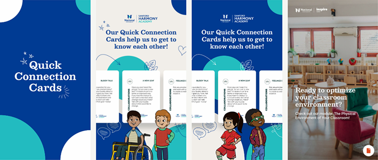
Harmony Academy, a tuition-free recovery high school, needed a website that effectively communicated its mission while increasing engagement and donor conversions. Partnering with Fifty & Fifty, Harmony Academy underwent a strategic website redesign. As a result, the organization witnessed:
- 76% decreased cost per registration
- 2-3x Conversion rates
- 31% total coat reduction
Additionally, the strategically placed call-to-action buttons have driven higher donation levels, enabling the organization to extend its programs to more local schools and support a greater number of student participants.
Now’s the Time to Redesign — Before Year-End Giving Peaks.
We help nonprofits quickly transform outdated sites into conversion-ready donation hubs. Schedule Your Free Redesign Consultation today.
LET’S TALK
Average Costs of Nonprofit Website Redesign & Maintenance
One of the biggest questions nonprofits face when considering a website redesign is: How much will it cost? The answer depends on the scope of work, rather than just the size of your organization.
A website redesign is made up of multiple components—discovery, design, content strategy, development, SEO, accessibility, and integrations—and each factor affects the overall budget. Below, we break down typical costs by project scope to help you estimate your investment more accurately.
Discovery & Strategy ($2,000 – $10,000+)
The discovery phase ensures your website redesign is strategically aligned with your mission, audience, and goals. This process typically includes:
- Stakeholder Interviews – Understanding the needs of internal teams and supporters.
- Competitive Analysis – Reviewing similar organizations to identify opportunities.
- User Research & Testing – Analyzing visitor behavior and user experience gaps.
- Information Architecture (IA) Planning – Mapping out an intuitive site structure.
Cost Factors:
- The depth of research required (surveys, heatmaps, A/B testing, etc.).
- Number of stakeholder workshops and revisions needed.
- Whether existing analytics data can be leveraged or new research is required.
Budget Range:
- Basic Discovery: $2,000 – $4,000
- In-depth Strategy & User Research: $5,000 – $10,000+
Design & Branding ($3,000 – $20,000+)
A visually compelling and user-friendly design is crucial for engagement, credibility, and conversions.
- Wireframing & UX/UI Design – Creating page layouts for key sections (home, donation page, about, etc.).
- Custom Graphics & Branding – Visual storytelling elements like icons, infographics, and branded imagery.
- Mobile-First Responsive Design – Ensuring an optimized experience across devices.
Cost Factors:
- Number of page templates needed.
- Extent of custom design vs. using pre-made templates.
- Level of branding updates required.
Budget Range:
- Basic Template-Based Design: $3,000 – $6,000
- Custom Website Design with Advanced UX: $10,000 – $20,000+
Content Strategy, Copywriting & Migration ($2,000 – $15,000+)
Your website content is just as important as design. Without clear, compelling copy, visitors won’t take action.
- Content Inventory & Audit – Reviewing existing content for relevance and gaps.
- SEO-Optimized Copywriting – Crafting donor-friendly, high-converting messaging.
- Content Migration – Moving text, images, and media from your old site to the new platform.
Cost Factors:
- Amount of new content creation vs. repurposing existing copy.
- Whether SEO research and keyword integration are required.
- Complexity of content migration (manual vs. automated).
Budget Range:
- Content Audit & Light Copy Editing: $2,000 – $5,000
- Full Content Strategy + Copywriting: $6,000 – $12,000+
- Large-Scale Content Migration: $3,000 – $15,000
Development & Custom Features ($5,000 – $40,000+)
This phase brings everything to life, transforming design and content into a fully functional, interactive website.
- Custom Website Development – Building out key pages and templates.
- Donation Platform Integration – Ensuring smooth donation flows.
- CRM & Email Integrations – Connecting with Salesforce, Mailchimp, or other tools.
- Event Management & Volunteer Signups – Creating interactive engagement tools.
Cost Factors:
- Number of custom features & integrations required.
- Platform chosen (WordPress, Webflow, custom CMS).
- Level of back-end customization (e.g., complex donor dashboards).
Budget Range:
- Basic Website Build: $5,000 – $12,000
- Custom Feature-Heavy Development: $15,000 – $40,000+
How Technology Choices Impact Website Redesign Costs
One of the biggest factors influencing nonprofit website redesign costs is the underlying technology—specifically whether you choose an open-source or proprietary platform. Your choice affects initial costs, scalability, security, maintenance expenses, and flexibility. Here’s how different technologies impact your budget:
1. Open-Source Platforms (WordPress)
Best for nonprofits needing affordability & flexibility.
- Lower upfront costs (software is free; you only pay for hosting & development).
- Highly customizable with thousands of themes & plugins.
- Wide developer community = lower maintenance costs & ongoing support.
- Requires some technical expertise for customization & security updates.
Typical Cost Range:
- Basic WordPress site: $5,000 – $10,000
- Custom WordPres site with integrations: $15,000 – $30,000
- Complex nonprofit platform with CRM & donation tools: $30,000 – $50,000+
Best for: Nonprofits that want cost-effective, scalable websites with control over future enhancements.
2. Proprietary Website Builders (Wix, Squarespace, WebFLow)
Best for small nonprofits needing a quick, no-code solution.
- Low upfront costs with monthly subscription pricing.
- User-friendly drag-and-drop editors (no coding required).
- Hosting, security, and updates handled for you.
- Limited flexibility & scalability (difficult to add custom features).
Typical Cost Range:
- Wix/Squarespace site with basic functionality: $500 – $5,000
- Upgraded plan with ecommerce & donations: $5,000 – $10,000
- Limitations: Higher transaction fees on donations, less control over SEO, restricted integrations.
Best for: Small nonprofits with simple needs, limited budgets, and no in-house developers.
3. Custom Proprietary CMS (Salsa, HubSpot)
Best for large nonprofits with complex needs & high-security requirements.
- Tailored to specific nonprofit functions (donor management, advocacy, event fundraising).
- Enterprise-grade security & compliance (great for healthcare & large advocacy orgs).
- Often includes built-in CRM & marketing automation tools.
- High licensing & long-term costs (vendor lock-in).
Typical Cost Range:
- Custom nonprofit CMS setup & licensing: $30,000 – $100,000+
- Annual maintenance & support fees: $5,000 – $20,000
Best for: Enterprise-level nonprofits needing deep CRM integration, advanced donor engagement tools, and dedicated security compliance.
SEO & Analytics Tracking ($1,500 – $8,000)
A beautiful website is useless if no one finds it. SEO ensures your nonprofit ranks higher in search results and attracts organic traffic.
- Technical SEO Optimization – Page speed, mobile usability, metadata, site architecture, crawlability, broken links and internal linking, schema markup, etc.
- SEO Content Optimization– Content Strategy & Keyword Research targeting high-intent search terms.
- Advanced Analytics Setup & Reports – Google Analytics, Tag Manager, UTM tracking, donor conversion funnels.
Cost Factors:
- The level and number of pages requiring content optimization.
- Custom tracking requirements
- Local SEO, Global SEO, or both.
- Technical SEO optimization complexity.
- Off-Page Optimization.
Budget Range:
- Basic SEO Setup: $1,500 – $3,000
- Comprehensive SEO + Analytics Strategy: $5,000 – $8,000
Accessibility & Compliance ($2,000 – $10,000)
A truly inclusive nonprofit website must be accessible to all users, including those with disabilities.
- ADA & WCAG Compliance Audits – Identifying accessibility gaps.
- Screen Reader & Keyboard Navigation Support – Making content accessible without a mouse.
- Color Contrast & Font Adjustments – Ensuring readability for low-vision users.
Cost Factors:
- Level of compliance required (basic fixes vs. full WCAG 2.1 AA certification).
- Complexity of accessibility integrations (e.g., AI-powered accessibility tools).
Budget Range:
- Basic Compliance Enhancements: $2,000 – $5,000
- Full ADA Compliance & Audits: $7,000 – $10,000
Ongoing Website Maintenance & Support ($100 – $2,500/month)
Once your website is live, regular maintenance ensures security, performance, and updates.
- Hosting & Security – Keeping your site safe from hacks.
- Regular Updates & Bug Fixes – Ensuring smooth operation.
- New Content & SEO Adjustments – Keeping information fresh.
Cost Factors:
- Level of tech support & updates needed.
- Whether the nonprofit has an in-house team for minor edits.
Budget Range:
- Basic Hosting & Security: $100 – $300/month
- Ongoing Content & SEO Updates: $500 – $1,500/month
- Full-Service Web Management: $2,500/month+
Budget Examples for Different Nonprofits
To illustrate how these costs come together, here are sample budgets for different nonprofit needs:
Budget Friendly Vs Custom-Build Website Redesign
Choosing between a budget-friendly website redesign and a custom-built website depends on your nonprofit’s goals, technical needs, and long-term vision (learn more about planning and budgeting in our nonprofit budget plan guide). Below is a comparison table to help you determine which option aligns best with your organization’s requirements.
Is It Time for a Redesign? Ask Yourself These Questions
If you answer “yes” to any of the following, it’s time to consider a redesign:
- Is your website more than 3–5 years old?
- Do visitors struggle to find information or donate easily?
- Does your site look outdated or unprofessional?
- Is it slow to load or not mobile-friendly?
- Are your engagement and donation rates declining?
Your nonprofit deserves a website that drives real impact. Let’s create a site that maximizes engagement, boosts donations, and fits your budget. Schedule a call with our team today to discuss how we can get you there!
Real-Life Examples of Successful Nonprofit Website Redesigns
1. The San Diego Foundation – Increased Conversions by 41%
The San Diego Foundation needed a website that better reflected its role as a community leader in philanthropy. Their previous site was cluttered, difficult to navigate, and lacked clear calls to action, making it challenging for users to access funding opportunities, learn about initiatives, or donate effectively.
Partnering with Fifty & Fifty, the foundation’s website was completely overhauled with a focus on:
- Refined user experience (UX) – Streamlined navigation to guide different audiences seamlessly.
- Stronger brand storytelling – Engaging visuals and clear messaging reinforced the foundation’s mission.
- Optimized donor & partner engagement – Enhanced donation flows and easy access to grant information.
- Improved accessibility & mobile responsiveness – Ensuring all users could interact with the site effortlessly.
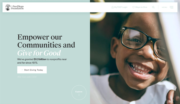
As a result, the website achieved:
- 41% increase in conversion rate
- 31% improvement on email signup
- 142% increase in lead-gen on private foundations
2. Kindness.org – Fueling Digital Growth
Kindness.org conducts research on kindness and applies their findings to develop programs in schools, workplaces, and communities. As a relatively new nonprofit, they wanted to grow: get in front of more people, expand programs, engage communities, and find partners.

In partnership with Fifty and Fifty, the organization created a website designed to get people excited about the power of kindness and engaged in kind acts. The website also provides education about their programs, including a new Work Kind program.
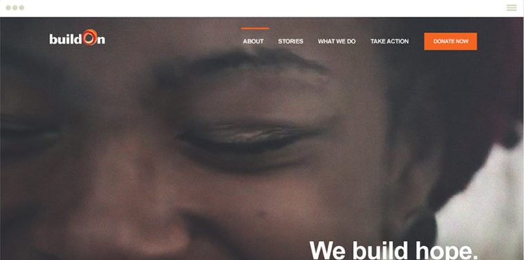
3. BuildOn – Building a Better Narrative
The mission and goal of BuildOn is bold and unique, but learning how to communicate that was a great challenge. With a new action model to serve their umbrella mission of ending the cycle of poverty, illiteracy, and low expectations. Fifty and Fifty was tasked with visually communicating their two-fold project development of U.S. and international service and education.
Ready to Transform Your Nonprofit’s Website?
Your nonprofit’s website is the digital frontline of your mission, a tool for impact, and a driver of donor engagement. Whether you’re raising funds, mobilizing volunteers, or increasing awareness, a well-designed website can make or break your ability to inspire action.
A strategic nonprofit website redesign isn’t about aesthetics alone—it’s about ROI. A website that loads quickly, tells compelling stories, and guides visitors toward action directly translates into increased donations, better volunteer engagement, and stronger community trust.
Our expert team specializes in impact-driven nonprofit web design tailored to your budget. Schedule a call with our team today!
Have a project or idea?
We believe in the hard work people are doing to address the world's most pressing problems. Every day, our agency fights to turn visions of social change into concrete realities.
Best Website Builders for Nonprofits: Comparing Features, Pros & Cons

Nonprofit CMS Guide: How to Choose the Right One
Best Nonprofit Website Hosting: Free & Paid Options [2025]

Nonprofit Website Templates: Top 14 Free & Custom Options [2025]
